Olympic Winter Games Lillehammer 1994
Lillehammer 1994The Brand
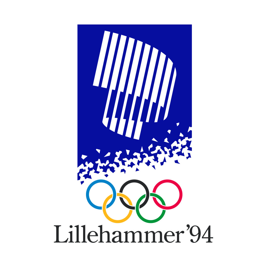
Emblem
It is composed of a stylised aurora borealis (Northern lights), the five Olympic rings, snow crystals and the title, "Lillehammer '94". The emblem is a development of the aurora borealis symbol used during the candidature phase. It was inspired by contact with nature, the sky and snow. The aurora borealis is a natural phenomenon due to the northerly position of Norway. It has associations of power, great tension and dramatic spectacle. The main colours of the emblem are cobalt blue and white.
Poster
The posters, produced following the rules of the Lillehammer Games design programme, were meant to incorporate three main aspects: Norwegian originality and particularity, human contact and contact between mankind and nature. The design programme was the main tool in achieving the goal of presenting a unified image. It featured basic visual elements which could be combined in different ways to serve as a basis for recognition and identification: the Lillehammer emblem, the pictograms, the pictographic emblems, the crystal theme, colours, typography and the mascots.
Lillehammer 1994: Nature and Tradition
Olympic design made in Lillehammer, a threefold design concept: originality and Norwegian character, human contact and contact between man and nature. Focused on respect for the environment, these were named the “White-Green Games” by President Samaranch.
Learn more on the virtual exhibition of the Olympic Museum.
1994
Discover the Games
The Brand
A visual identity is developed for each edition of the Olympic Games.Brand
The Medals
Beginning as an olive wreath, medal designs have evolved over the years.Medals
The Mascot
An original image, it must give concrete form to the Olympic spirit.Mascot
The Torch
An iconic part of any Olympic Games, each host offers their unique version.Torch
